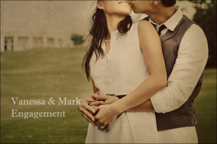
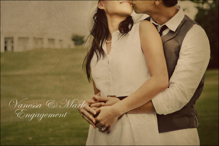
I need an opinion for a very vintage-themed slideshow. Which font do you think gives more of a Great Gatsby feel to the image? I was actually looking at the book I owned, but I'm not a fan of the cover. I can't decide. The first one makes it look more like a book cover, and the second one I just like for no particular reason!
One.
Two.
2 comments:
I like the second one better, it adds more elegance which was often the appeal during the time when the Great Gatsby is set as well as a major theme in the book.
It's so funny you bring up the Great Gatsby since I'm reading a book about that :p Anyways, I like the second one since it fits the grand, majestic, and mysterious time during that period.
Post a Comment